
 be eyecatching but I felt this went with my bright colour scheme so therefore didn't look cheap. If my magazine had a black and white serious colour scheme it wouldn't go at all and look completely out of place. I think it made my magazine look more realistic because it is a covention used in a lot of existing magazines. In a lot of magazines I have seen a medium close up of the main model on the front cover. I want to replicate this because I think it makes the main model look dominant and it will really stand out on a shelf. Also it is very important for the image to have great eye contact with the audience as it will attract readers. It creates a personal relationship between the model and the reader. In addition to this I placed the model's head infront of the masthead, m
 eaning that you slightly can't read ERA. However, I made my media product
 assuming it was a real product which meant that the audience do not need to see the whole of the masthead because they already recognise it from the logo and font style. A lot of existing music magazines do this. Again it puts more focus on the main model.
At the bottom of the page I put the name of the main feature, Harlie Anne. When making the magazine I assumed Harlie Anne was a celebrity so by including a large image of her and her name in a large font, it will attract customers, especially her fans. I got this idea from the Q
 edition featuring Cheryl Cole.
 so I kept in theme with the edgey and modern impression. Underneath this was a small picture of the front cover which I have seen being used in other magazines. All of these conventions illustrate a professional and realistic impression.
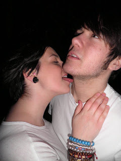
 .jpg)
.jpg) makes my double page spread unique compared to existing pages and creates an interesting appearance. I also have a blind effect background which I have never seen before in other magazines. The blind effect creates different shades of colours aswell.
makes my double page spread unique compared to existing pages and creates an interesting appearance. I also have a blind effect background which I have never seen before in other magazines. The blind effect creates different shades of colours aswell. sed through the bright, modern colour scheme. My main model, Harlie Anne attracts men because she is attractive and has a seductive pose. At the same time women would aspire to
  her and envy her because of her quirky style and good looks. I noticed that using white people for models was a convention of existing rock magazines which is why I did it aswell. Stereotypically, rock magazines are associated with white people whereas rap and R&B magazines are associated with black people.
 imilar and therefore rivals. In that case they will stay loyal to a long running, well known successful magazine opposed to a new substitute.
On the other hand, Bauer Consumer Media distributes magazines that attract more mature audiences aswell, for example Q. Q started out as a music magazine published monthly in the United Kingdom. Originally it was to be called Cue (named after the act of cueing a record to play), but the name was changed so that it wouldn't be mistaken for a snooker magazine. Founders Mark Ellen and David Hepworth felt the music press of the time ignored a generation of older music buyers who were buying CDs. Q was first published in 1986, setting itself apart from much of the other music press with monthly production and higher standards of photography and printing, with an emphasis on style. This shows that Bauer Consumer Media distribute a wide range of magazines. Kerrang and Q both are associated with rock music though, similar to my magazine. This means that Bauer Consumer Media may be more open to distributing my magazine as they accept a lot of different magazines.
 ese images are typical people that I am targeting my media products at.


5. How did you attract/address your audience?
I wanted my media product to clearly represent the rock/indie music genre to attract my youthful audience. I did this in many ways including having a a young main model, Harlie Anne that has a rocky, quirky style. This is portrayed through her dark clothes including a leather jacket, her pale face, dark smokey eyes, bright red lips and her intimidating pose but at the same time being seductive and mysterious. Also, the bright colour scheme reflects the modern and vibrant audience. But I made sure I used a lot of black elements because the dark colour is stereotypically associated with the rock genre. White is also used a lot in existing magazines because it is a contrast to black and other colours so everything stands out o it. Another way that the rock genre is represented is through the masthead font style. The font is called masterplan which I fo und on dafont.com. It has a rough, patchy, faded appearance which looks modern and edgey. This relates to my main model and therefore my target audience. Most existing magazines use celebrities as the main image on their front cover because the audience are very interested in celebrities lifestyles so therefore it attracts people as they want to read about there favourite artists. For example, Cheryl Cole's edition in Q. In relation to this I produced by music magazine on the assumption that my main model, Harlie Anne was a famous artist. I made this clear by her name being prominent in a large font on th
 e front cover. In doing this it means it will attract her fans. This is especially significant to the story because it is about her comeback with a new style and attitude. People will be very interested in finding out about her new style. Also Harlie Anne's good looks and endeering pose will attract men into buying the magazine and women who aspire to help. I used persuasive and inviting text to attract people into buying my magazine. This includes having exciting words such as exclusive which make the sentence stand out more. For example my strapline, "exclusive interview and images inside" is far more interesting that just having interview and images inside. There is not a lot of text but enough to give an idea of what is inside. I found that images and colour scheme were more important than text because they stand out more on a shelf. The text uses normal everyday language which attracts readers as it's not intimidating. The readers are more interested about the music than a high use of special vocabulary words. Two of the stories use rheotorical questions which are "Do you know the real Harlie Anne?" and "Just friends?" This is a very clever technique as it is a subtle persuasive way of making the audience read the magazine to find out the answers. In addition to this, my pug is a way of attracting people because it stands out and is about a chance of winning reading & leeds festival tickets. It was important to have a prize that my target audience would want, otherwise it would be pointless. Reading and Leeds festival are both young festivals that mostly include rock/indie artists which relates to young teenage rock/indie fans, my target audience.
6. What have you learnt about technologies from the process of constructing this product?
Before i took my photos I bought a new camera so I could produce high quality photos and therefore make my magazine look realistic. My digital camera is an Olympus FE-5020. It is 12 megapixels and has 5x wide zoom. It was excellent when taking my photos as I could change so many features to suit the image. I did encounter a few problems when taking my photos in the dark. Obviously I had to use the flash but I felt like the flash made the model's face too bright. However, this was easily overcome by changing the flash and lighting effe cts. It was also very easy to copy the images from the camera onto the computer. The main piece of technology I learnt from was photoshop which I used to produce my media product. I have previous experience on it from GCSE and the preliminary task for this coursework but I still felt like a beginner. I did have a slight advantage over the people with no experience and never had done the subject before. I think it helped with a lot of practise and patience because photoshop can be very irritating when it doesn't do the things you want it to. A thing that was particulary annoying was when I wanted to place the main model's head infront of the masthead. This is because she had to be cut out and then placed perfectly on top so everything matched up correctly. Then I had to neaten up the edges with the eraser. This process did take quite a long time but I think it was worth it as it produced a proffessional and effective appearance to the front cover. I also found little things that I never knew of such as the burning tool. Little things like these made a big impact on my media product such as creating a more dark and powerful impression on the double page spread. The dodge tool does the opposite of this by adding light to specific areas which makes them less dull and prominent. Another piece of technology I used during this project was a blog. Instead of having a folder, I had to upload all my work on a blog. Blogger is very easy to use when adding, editing posts and it allows you to do things suc
 h as online polls. Doing a questionnaire by hand would mean printing a lot of copies, handing them out and having to add up all of the results which is time consuming and tedious. Having it online means you can just send people the link and it calculates the results by itself. It is simple and quick. Another advantage of blogger is that it eliminates the large amount of time spent on making a folder look attractive. The main benefits of blogger is that it is simple, quick and teachers can help you at anytime because they have access to this. In relation, I can access it anywhere including my home and school.


.jpg)

.jpg)
.jpg)


.JPG)

.JPG)


.jpg)