Front Cover

Contents Page
.jpg)
.jpg)
Double page spread
.jpg)

 Stage 1: Firstly, the picture wasn't large enough to fit all of the page and it would look to stretched anyway. To solve this problem, using the cutting tool I cut out a section of the grey background and pasted it 3 times beside the photo as shown above. Copying the exact same shape made them all equal and it gave a blind effect. I also added a black border to make the page look smart and professional.
 Stage 2: Next I added the title in the font Stencil which gives an edgey and powerful impact. I added a line of text underneath which made the title make sense and it gives the readers a summary of the article. I added a thin black rectangle underneath to clearly establish between the title and the rest of the text. I decided to slightly rotate the title to make it look interesting and quirky. I then added the text which was in keeping with the red and black colour scheme which is used on the front cover and in the contents aswell. I got the white picture frames from google images and then placed my own images over the blank space. I think the photo frames are much more interesting and proffessional then just placing the image on the page.
  Stage 3: I thought I had finished my double page spread but I then decided that it looked a bit plain and there was not enough writing. I also made the columns equal sizes as this is a lot more professional. For each of the questions in the article I tilted them to relate to the title and always used the same font as the title. I placed each one in a black box to make them stand out but I didn't want them to be overpowering so I decreased the opacity of them to 54%. This made them look not as harsh. I also added the website and page number in the bottom left corner to make the page look realistic and it is a convention used by existing magazines. I made the page numbers the same as how they are on the contents, a white number in a red box, to keep with continuity. I also added a little ERA logo at the end of the article because I have seen it used in existing magazines and also a quote to draw the readers in.
 Stage 4: For the last little touches I burned the corners of the background using the burning tool. This makes the page look more dramatic and dark which relates to the rock genre. Using the dodge tool, I removed the shadow from the top of the model's hair and in doing this I made her hair slighlty brighter. I wanted to make the photo frames more realistic so I duplicated the layer, then made the underneath layer completely black. I then clicked on filter, blur and then gaussian blur and increased it to 7 pixels. I did this to each photo and it gives a slight shadow round them. On the previous stage, the quote was too small and didn't fit in at all so I enlarged it, changed the colour to stand out on her skin and slighlty tilted it so it was similar to the other text. The positioning actually looks like it's coming out of her mouth. This is quite clever because it is words from her mouth, a quote. To finish it off I added another page number in the same style as the one in the left corner.
 Stage 1: I didn't want the word contents to take up a lot of space and I also wanted it to be unique so I placed it vertically down the page. I got the font from dafont.com and I cut out each letter seperately so I could rotate them individually. I then added a thin red rectangle to section it off. I tilted the main image and then added a border that didn't exactly fit to make it look edgey and modern.
 Stage 2: I then added the text and followed the pattern of having the title of the story in bold capitals in the font Impact and then a little summary of the story in lower case in the font Rockwell. I wanted to incorporate more red as it is vivid and draws you in so for the page numbers I used white numbers in a red box. I wanted to maintain professional by making each box the same shape so instead of making a new shape everytime, I duplicated the layer several times. I also added the pager number on the main image to make it clear to the readers where it is and it is also a covention used by existing magazines.
 Stage 3: This is where the contents page starts to take place as I added all the photos. Throughout my magazine I have tilted the photos because I think it gives a quirky appearance and makes the change between a simple image and a more interesting image. Using the burning tool, i slightly burned the edges of the bottom middle picture (Alexandria story). This gave the image a darker and dramatic look. I also added little things to make the page look realistic such as placing the website in the top right corner and the ERA logo in the top left corner.
  Stage 4: I added a little red rectangle underneath ERA so it relates to the front cover masthead. Then there were little end touches which included putting the page numbers on the bottom pictures. For all 3 of them I used black numbers on a grey background to clearly seperate it from the page numbers next to the text. This is because I wanted the red ones to stand out. I added a shadow around the grey page numbers by duplicating the layers, then filling the underneath layer in black. I then clicked on filter and then blur and then increased gaussian blur to 7.0 pixels which created a slight shadow round the edges. The white background looked to simple and mature. This is significant because I am targeting a young audience, a white classy background would suit Q's more mature audience. To make the page more modern and quirky I used a paint brush with a dappled effect in a very large size, about 500px which created a splattered effect and I randomly splattered it in places I decreased the opacity to make it grey rather than black because black would be too overpowering. Lastly, I included a little image on the front cover in the bottom left corner to make the page look more interesting and it combines all the pages.
  Stage 1: I found the font from dafont.com and print screened it so it would have a white background. I wanted this so it contrasted to the grey background. The problem with the masthead is that it is too small and if i had it any larger it would cover the model's face. I overcome this in the next stage.
  Stage 2: To put the model's head infront of the masthead I cut her out using the magnetic lasoo tool and made a new layer so it resulted in there being two layers of the model's face. I then copied and pasted the the new layer onto the main page and lined it up with the underneath layer. I then softened the edges using the eraser tool. The model's head is now able to be infront of the masthead. In addition to this I enlargened the masthead and added a thin red rectangle underneath it. This clearly seperates the masthead with the background and also gives a professional look. I added a strapline at the bottom of the page using a red rectangle with text ontop of it. I decreased the opacity of the shape so it wasn't too overpowering and I felt that the red looked a bit cheap and trash. The slighty pink rectangle looks more subtle and smart.
  Stage 3: I then added the text Harlie Anne in the font Lucida Calligraphy which completely contrasts to the rocky, edgey style of the magazine because the font style is quite mature and girly. However, I wanted to do this because the style clearly stands out in reference to the other features and it is also the only font in a white colour. The girly font style also relates to the main story of how Harlie Anne has changed from a girly girl to a rock chick. I then added a thin blue rectangle underneath the title with a slight tilt to emphasise the title and the colour also ties in with the colours used in the smaller images of her and the pug. I then added 3 smaller images of the main model and slightly tilted them all to create a quirky style. The main reason why I included more images of Harlie Anne because I took so many photos of her in 3 different locations so I didn't want them to be wasted. It also attracts the audience in by seeing her in different locations. I also added red text relating to the main image as the majority of existing magazines do this and it gives the audience more information on what the story entails.
 Stage 4: I then added images of other stories because I want the magazine to look like its packed with different features. It wouldn't make sense just to promote the main story because it makes it seem like the actual magazine is only about that. It is important to focus on other stories aswell. I also added the s title for each story to relate the image to a story and therefore make it look like a believable story. I then added a black border around the "Princess of Rock" story to make it look more edgey and it also inkeeps with the contents page because I put a jagged border around the main image on there. I also created a slight shadow around the "Just Friends" story by adding a gaussian blur of 10 pixels. I then added a pug which is the same colour as the blue rectangle underneath Harlie Anne. A pug can look quite cheap but I think it fitted in with my busy front cover and colour scheme. I have also used it because it is a covention used by many existing music magazines. I then added little last things to make to finish off the front cover and make it look more professional. This included adding the date and issue number vertically up the side of the masthead and I also added a barcode in the bottom left corner, again rotated vertically. It is little things like this that make the front cover look more realistic and professional.
  I really like this image because it shows off the model's great features. Her hair naturally lays on scattered CD's which acheives a more realistic appearance. I had a problem with other photos because the CD's looked too neat and therefore staged. Another good thing about this photo is the colour of the flower matches her pink lips, cheeks and under garment. Her smokey eyes create a smouldering and seductive image. This is one of my favourites so I will be using it either in the contents or a small image on the front page.
 This image did not exactly plan out how I intended it to. I wanted to create a sexy and cheeky mood by getting the model to bite a CD. However, I did not initially realise that by doing this pose, you will get a reflection of her nose as seen above. This ruins the picture and makes it seem unprofessional. It would definitely work better with a non-reflective CD. Another problem is that the model's hands look too large in comparison to the rest of her. This takes away focus from the model's face.
 The problem with this image is that there is not enough CD's enabling you to see a lot of the wooden floor. This looks slightly unprofessional but it can be solved by cropping the picture and trimming some of the top off. I like the model's pose in this photo because she is creating a girly image aided by the pinkness but at the same time you can see her dark, mischevious side. She has a cheeky, sexy mouth expression combined with her smouldering dark eyes.
 The problem with this image is that the CD's look to neat and precise so therefore staged which I really wanted to steer clear from. Also I think her faces looks a bit uncomfortable which will come across to the audience. Again this makes the image and situation unbelievable. Having a longer shot enables you to see her pink underwear which looks great due to it's striking colour. I also like the way she is holding her jacket but as her hands are closer to the camera, it does make them look quite large.
 I also did some images on a pink bacground to emphasise girlyness in contrast to her black jacket and leggings. It also enables you to see her amazing figure which is likely to attract a male audience. I really like this how this image looks natural and just caught in the moment which I think is due to jacket being off one of her shoulders and her causual pose. She looks innocent and vulnerable which makes her look even more attractive because you feel sympathy for her. There is no eye contact but that is not as significant because it's not going to be used for the main image on the front cover.
In contrast to the picture above, in this image there is great eye contact. I really like the simpleness of this photo because it's still effective and she looks very pretty. She has a sexy pose in addition to her long, lushious hair. Again, her figure looks amazing. The good thing about this model is that obviously men will be attracted to her but at the same time women will not be intimated by her because she looks friendly and down to earth. The use of the black photo frame makes the backfround look more interesting but doesn't take focus away from the model, it compliments her. This is one of my favourite images so it is likely I will use it for either a small image on the front cover or in the contents.
"Just Friends?" story
.JPG)

.JPG)
Again I changed the image to black and white but kept the colour of the flower to make the image more interesting and unique. It still creates a sexy mood without looking cheesy and fake. This image expresses intimacy and love. I really like how comfortable the models look because I was afraid that awkwardness of being photoed and also the freezing cold would come across in the photo. Instead the photos all look realistic and natural. The female running her hands through the male's hair looks sexy and passionate. I really like how they both have white shirts on because it stands out in the black and white and also contrasts to the dark background. They also look quite similar but the pink flower clearly seperates the female from the male.

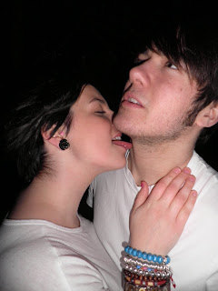
This image is before the transformation process. The picture shows a fun and mischevious side of their relationship. This is expressed by her cheesy grin and pulling of the shirt. There is great contact with them which adds to the cuteness. However, I think this is a disadvantage to the picture. This is because I wanted the images to portray a seductive and sexy embrace between the two. This image is too cute and therefore will not be suitable for my magazine.

This again shows a cheeky and mischevious side portrayed through the biting of the shirt. I really like the female's pose but you cannot see the male very well as his dark hair blends into the dark background. This will particularly be significant in black and white. The female is the main focus in this image as you cannot see any of the male's face but I want to express a relationship so therefore they are both as important. They are supposed to be a band so it would make more sense to show both of them. The male also looks quite hunched and therefore uncomfortable. Overall, I don't think this is a suitable image for my magazine.
In contrast to the previous image where the focus was on the female, this image clearly shows both of them and therefore expresses them as a couple. This is one of the images that are quite close up. This enables you to clearly see their facial expressions and good looks. Their attractive looks will attract both sexes as you'd expect the male readers to like the girl and female readers to like the man. I really like the female's pose because she looks naughty, cheeky and sexy. This is the ideal impression I wanted to create. I wanted a lustful embrace, not a romantic situation.

I like this image because it shows vulnerabilty and innocence especially due to her hands behind her back and her cute expression. It also expresses cheekiness and naughtiness. However, I do not think this image is suitable for the main image on the front cover because most front cover images are intimidating and striking. This image would'nt fit into that category at all but it could possibly be used for the contents or double page spread.
 I really like this image because it is creative and unique. It emphasises on her brilliant complexion, bright red lips and big eyes. However, this image would not be suitable for the front cover because the model is not directly looking at the camera so therefore will not have eyey contact with the audience which is essential. Also it would be hard to fit the mastplan and text on as the picture is so close up. I could use this image to make an interesting and unique double page spread though.
  I like the model's expression in this image because it shows her fun and young side. This relates to how I want my magazine to come across and also realtes the genre rock. Again this image would not be suitable for the front cover beacuse there is no eye contact and it isn't a very serious photo. However, it could be used as a small picture for the contents or double page spread. The picture needs to be cropped aswell.
 This shot is quite long compared to the other images which enables you to see her outfit and body. I really like the model's pose but again it is not suitable for the front cover as she doesn't have eye contact with the audience. It could be a very good image for the contents or double page spread though.
 This image has a very similar pose to the image above but in this image there is eye contact with the audience. Therefore, this would be more suitable for the front cover but I don't think the image is powerful enough. It is very important to have a striking image as it is a big reason why people are attracted towards magazines.
  I really like this image because the model is leaning forward, appearing like she is coming out of the photo which will attract people. Also her big eyes are inviting and the pose of her bright lips are seductive. The only problem with the image is that the positioning of her arms is quite awkward and therefore looks uncomfortable. Despite of this, I think this would be a very good image for the contents.
I like the background of this image beacuse it fits in with the colours of the model's oufit but because of this it would not be suitable for the front cover as it would be very hard to make the text stand out and not clash. I still really like the model's expression and the use of the hat really add to her original and punky style.
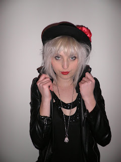 I really like this image because the seriousness of her expression create an intimadting and powerful mood. The pose of holding her collar also makes her look dominating and arrogant. These are clear features of a rock artists personality and what makes them so striking. Her eyes and lips are very alluring. I really like the hat because it fits in with the rest of her outfit, especially the red flower tieing in with her bold red lips. I initially decided that out of all locations I wanted the front cover main image to be one from the white wall pictures. This is because it will be easy to fit everything around it and it will stand out in contrast to the whiteness. I have decided to use this image for the front cover because of the pose and I can image all the other features of the front cover surrounding it.
Location #2
 This image is low angle which makes the model look superior and powerful. Her serious expression relates to this but at the same time contradicts to being in a playground which represents fun and youth. I really like this image because it enables you to see her whole outfit which is quirky and modern. Also, the colours in her outfit go with the red poles and blue bars. The outfit stands out due to the darkness. This image would be suitable for either the contents or a small image on the front cover because it fits in with the colour scheme.
 This contrasts to the image above as this is a high angle shot. This represents vulnerability and innocence which relates to being in a child swing and a playground. I really like the use of swings and props in all images because it is interesting and unique. Also there is great eye contact with the audience. The only problem is that her arms look a bit uncomfortable.
 The models bright hair and outfit really stand out in contrast to the dark background which is why she is so dominating and all focus is on her. Again I really like the use of the bench and there is even blue bars of the bench which tie in with her blue sweater. The only problem with this image is there is a bit too much exposure on her face making it very bright but this can be adjusted. Again there is too much exposure on the models face but this is not a major problem and can easily be adjusted. This picture also needs to be cropped because by slightly trimming more of the ground off, it will put more focus on the model. The photo isn't busy and the bench is simple which is an advantage because there is already a big focus on the model. The model is slightly leaning towards the camera which is very inviting to the audience. Again she has a striking and dramatic pose. The whole point of this location was to illustrate the models fun and quirky side which completely contrasts with the edgey and eery location #3. All locations are expressing the different sides of the models personality.
 I love this image because the location looks amazing. The lighting makes the place look eery, dark and mysterious which relates to the darkness of rock music. The problem with this image is that because the location is so overwhelming, it takes emphasis of the model. The model doesn't stand out due to her dark clothing but this could be adjusted by changing the lighting around the model.
 This image is much better then the above because there is more emphasis on the model but you can still see the brilliant background. Because the model is closer, there is more lighting on her making her the focus. This is another example of a low angle shot which makes her superior and therefore important. Her moody facial expression relates to the eery location which is important because it would look silly if she was happy and smiling in a dark and chilling place.
  This picture is interesting because the colour of the trees and surrounding matches the colour of the model's dress. In addition, her black leather jackets and boots make her prominent and stand out. I think it is important to match colours because it creates a proffessional appearance and clashing colours can look messy. I like the background because it looks edgey and dark but I think the tunnel pictures are more interesting.
 I like the model's expression because as I have said before I want to demonstrate a fun and youthful side of her. This relates well to the graffiti wall because graffiti illustrates youth and uniqueness. The only problem with this image is that is quite long which means the model only takes up half of the image in terms of height. As a result she is not as dominant as some of the previous pictures. However, this can easily be solved by cropping but this does mean you have to sacrifice some of the brilliant graffiti.
 I love this image because the model looks so pretty and it all looks so effortless but still effective. Her pose is casual and simple but again so effective because she looks amazing. It is quite close up meaning she is covering parts of the background but you can still see enough of it. That doesn't matter as much anyway because the model is the main focus. Another reason why I like this photo is because the great eye contact really attracts you in and her facial expression is so serious making her look mysterious and interesting. I think this would make a great main image for the front cover but because of the background I think it will be to difficult. I am still definitely going to use it somewhere in my magazine, probably the contents or a smaller image on the front cover.
 Rock music has a reputation of being rebellious and outspoken which is what I wanted to portray in this image. I particularly like this image because it looks natural and not staged. This is important because I want my magazine and its stories to be believable. It is a great action shot but I did miss out her left hand. This could be and advantage though because again it adds to the picture being natural and looks like it was taken without too much thinking. Basically it doesn't look staged and that I quickly captured her moment of madness.
 Out of all the double page spread ideas, this one is the most packed and busy. For that reason I really like it because as I've mentioned before I want my magazine to follow a theme of choas and hecticness. This is to create a fun and modern impression. I like how the images symetrically run down both sides and it takes up quite a bit of space, hence the busy look. It is also quite unique how the title is ontop of the image. In all of the double page spread ideas I have included a quote. This is because when analysing existing magazines I discovered that it was a common convention. I think it makes the page seem more professional and realistic.
 This idea was highly influenced by the NME legends edition which you can find in my analysis of existing music magazines. In particular it was the double page spreads that were about each member of greenday. It basically divided the page into a page with text and an image covering the rest of the other page. I also took the idea of doing a little fact box about the person featured which I think is a fun and interesting idea. The only difference to NME's was I placed another image on the text page so the page isn't plain and it shows the model in different locations.
  This idea shows that the main image and title run throughs both pages. When constructing a double page spread I will have to be very careful in where the crease of the magazine is. It is still possible to have things overlapping onto both pages though. This idea includes a quite a few images which is quite uncommon for typical double page spreads. Ones I have analysed have shown a very large main image and then one or two small images. I still want my main image to be the most dominant and effective image though.
 This idea is different to contents idea #1 and #2 in the way that contents is vertical. This is a unique style that enables you to include more stuff on the page because it doesn't take up a lot of space. Also this idea isn't as busy as the other two contents. However it still includes a lot of images and I want to use little unique elements such as putting ripped tape on an image or a few. This makes the image appear rough, edgey and young.
  From this idea I wanted to achieve a sense of uniqueness which I think I have as I havn't seen a contents like this is any existing music magazine. The text is in the middle surrounded by a lot of images. This idea follows the theme of choas and hecticness which I want my magazine to portray to attract my young audience. It creates a vibrant and fun impression. Similar to contents idea #1 I have included a lot of images, different shapes and angles to make them appear more interesting. There is not a blank space on this contents which makes it so prominent and powerful.
 This idea is very simple but if I carried through with this idea I would make it more exciting by using a bold and interesting font. Also I would use a lot of exciting and vibrant images to make the plain layout more busy and quirky. The sketch illustrates how some images are angled and have unique shapes which is far more interesting than straight positioning. Small images surround the larger main image which makes it clear what the main story is and how significant it is.