
 I really like this image because it shows off the model's great features. Her hair naturally lays on scattered CD's which acheives a more realistic appearance. I had a problem with other photos because the CD's looked too neat and therefore staged. Another good thing about this photo is the colour of the flower matches her pink lips, cheeks and under garment. Her smokey eyes create a smouldering and seductive image. This is one of my favourites so I will be using it either in the contents or a small image on the front page.
 This image did not exactly plan out how I intended it to. I wanted to create a sexy and cheeky mood by getting the model to bite a CD. However, I did not initially realise that by doing this pose, you will get a reflection of her nose as seen above. This ruins the picture and makes it seem unprofessional. It would definitely work better with a non-reflective CD. Another problem is that the model's hands look too large in comparison to the rest of her. This takes away focus from the model's face.
 The problem with this image is that there is not enough CD's enabling you to see a lot of the wooden floor. This looks slightly unprofessional but it can be solved by cropping the picture and trimming some of the top off. I like the model's pose in this photo because she is creating a girly image aided by the pinkness but at the same time you can see her dark, mischevious side. She has a cheeky, sexy mouth expression combined with her smouldering dark eyes.
 The problem with this image is that the CD's look to neat and precise so therefore staged which I really wanted to steer clear from. Also I think her faces looks a bit uncomfortable which will come across to the audience. Again this makes the image and situation unbelievable. Having a longer shot enables you to see her pink underwear which looks great due to it's striking colour. I also like the way she is holding her jacket but as her hands are closer to the camera, it does make them look quite large.
 I also did some images on a pink bacground to emphasise girlyness in contrast to her black jacket and leggings. It also enables you to see her amazing figure which is likely to attract a male audience. I really like this how this image looks natural and just caught in the moment which I think is due to jacket being off one of her shoulders and her causual pose. She looks innocent and vulnerable which makes her look even more attractive because you feel sympathy for her. There is no eye contact but that is not as significant because it's not going to be used for the main image on the front cover.
In contrast to the picture above, in this image there is great eye contact. I really like the simpleness of this photo because it's still effective and she looks very pretty. She has a sexy pose in addition to her long, lushious hair. Again, her figure looks amazing. The good thing about this model is that obviously men will be attracted to her but at the same time women will not be intimated by her because she looks friendly and down to earth. The use of the black photo frame makes the backfround look more interesting but doesn't take focus away from the model, it compliments her. This is one of my favourite images so it is likely I will use it for either a small image on the front cover or in the contents.
"Just Friends?" story
.JPG)

.JPG)
Again I changed the image to black and white but kept the colour of the flower to make the image more interesting and unique. It still creates a sexy mood without looking cheesy and fake. This image expresses intimacy and love. I really like how comfortable the models look because I was afraid that awkwardness of being photoed and also the freezing cold would come across in the photo. Instead the photos all look realistic and natural. The female running her hands through the male's hair looks sexy and passionate. I really like how they both have white shirts on because it stands out in the black and white and also contrasts to the dark background. They also look quite similar but the pink flower clearly seperates the female from the male.

This image is before the transformation process. The picture shows a fun and mischevious side of their relationship. This is expressed by her cheesy grin and pulling of the shirt. There is great contact with them which adds to the cuteness. However, I think this is a disadvantage to the picture. This is because I wanted the images to portray a seductive and sexy embrace between the two. This image is too cute and therefore will not be suitable for my magazine.

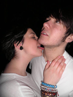
This again shows a cheeky and mischevious side portrayed through the biting of the shirt. I really like the female's pose but you cannot see the male very well as his dark hair blends into the dark background. This will particularly be significant in black and white. The female is the main focus in this image as you cannot see any of the male's face but I want to express a relationship so therefore they are both as important. They are supposed to be a band so it would make more sense to show both of them. The male also looks quite hunched and therefore uncomfortable. Overall, I don't think this is a suitable image for my magazine.
In contrast to the previous image where the focus was on the female, this image clearly shows both of them and therefore expresses them as a couple. This is one of the images that are quite close up. This enables you to clearly see their facial expressions and good looks. Their attractive looks will attract both sexes as you'd expect the male readers to like the girl and female readers to like the man. I really like the female's pose because she looks naughty, cheeky and sexy. This is the ideal impression I wanted to create. I wanted a lustful embrace, not a romantic situation.
No comments:
Post a Comment