
Location #1

I like this image because it shows vulnerabilty and innocence especially due to her hands behind her back and her cute expression. It also expresses cheekiness and naughtiness. However, I do not think this image is suitable for the main image on the front cover because most front cover images are intimidating and striking. This image would'nt fit into that category at all but it could possibly be used for the contents or double page spread.
 I really like this image because it is creative and unique. It emphasises on her brilliant complexion, bright red lips and big eyes. However, this image would not be suitable for the front cover because the model is not directly looking at the camera so therefore will not have eyey contact with the audience which is essential. Also it would be hard to fit the mastplan and text on as the picture is so close up. I could use this image to make an interesting and unique double page spread though.
  I like the model's expression in this image because it shows her fun and young side. This relates to how I want my magazine to come across and also realtes the genre rock. Again this image would not be suitable for the front cover beacuse there is no eye contact and it isn't a very serious photo. However, it could be used as a small picture for the contents or double page spread. The picture needs to be cropped aswell.
 This shot is quite long compared to the other images which enables you to see her outfit and body. I really like the model's pose but again it is not suitable for the front cover as she doesn't have eye contact with the audience. It could be a very good image for the contents or double page spread though.
 This image has a very similar pose to the image above but in this image there is eye contact with the audience. Therefore, this would be more suitable for the front cover but I don't think the image is powerful enough. It is very important to have a striking image as it is a big reason why people are attracted towards magazines.
  I really like this image because the model is leaning forward, appearing like she is coming out of the photo which will attract people. Also her big eyes are inviting and the pose of her bright lips are seductive. The only problem with the image is that the positioning of her arms is quite awkward and therefore looks uncomfortable. Despite of this, I think this would be a very good image for the contents.
I like the background of this image beacuse it fits in with the colours of the model's oufit but because of this it would not be suitable for the front cover as it would be very hard to make the text stand out and not clash. I still really like the model's expression and the use of the hat really add to her original and punky style.
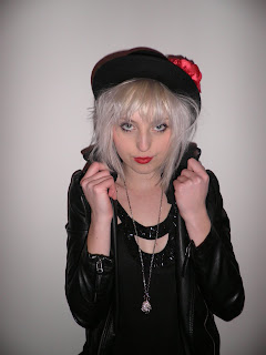 I really like this image because the seriousness of her expression create an intimadting and powerful mood. The pose of holding her collar also makes her look dominating and arrogant. These are clear features of a rock artists personality and what makes them so striking. Her eyes and lips are very alluring. I really like the hat because it fits in with the rest of her outfit, especially the red flower tieing in with her bold red lips. I initially decided that out of all locations I wanted the front cover main image to be one from the white wall pictures. This is because it will be easy to fit everything around it and it will stand out in contrast to the whiteness. I have decided to use this image for the front cover because of the pose and I can image all the other features of the front cover surrounding it.
Location #2
 This image is low angle which makes the model look superior and powerful. Her serious expression relates to this but at the same time contradicts to being in a playground which represents fun and youth. I really like this image because it enables you to see her whole outfit which is quirky and modern. Also, the colours in her outfit go with the red poles and blue bars. The outfit stands out due to the darkness. This image would be suitable for either the contents or a small image on the front cover because it fits in with the colour scheme.
 This contrasts to the image above as this is a high angle shot. This represents vulnerability and innocence which relates to being in a child swing and a playground. I really like the use of swings and props in all images because it is interesting and unique. Also there is great eye contact with the audience. The only problem is that her arms look a bit uncomfortable.
 The models bright hair and outfit really stand out in contrast to the dark background which is why she is so dominating and all focus is on her. Again I really like the use of the bench and there is even blue bars of the bench which tie in with her blue sweater. The only problem with this image is there is a bit too much exposure on her face making it very bright but this can be adjusted. Again there is too much exposure on the models face but this is not a major problem and can easily be adjusted. This picture also needs to be cropped because by slightly trimming more of the ground off, it will put more focus on the model. The photo isn't busy and the bench is simple which is an advantage because there is already a big focus on the model. The model is slightly leaning towards the camera which is very inviting to the audience. Again she has a striking and dramatic pose. The whole point of this location was to illustrate the models fun and quirky side which completely contrasts with the edgey and eery location #3. All locations are expressing the different sides of the models personality.
 I love this image because the location looks amazing. The lighting makes the place look eery, dark and mysterious which relates to the darkness of rock music. The problem with this image is that because the location is so overwhelming, it takes emphasis of the model. The model doesn't stand out due to her dark clothing but this could be adjusted by changing the lighting around the model.
 This image is much better then the above because there is more emphasis on the model but you can still see the brilliant background. Because the model is closer, there is more lighting on her making her the focus. This is another example of a low angle shot which makes her superior and therefore important. Her moody facial expression relates to the eery location which is important because it would look silly if she was happy and smiling in a dark and chilling place.
  This picture is interesting because the colour of the trees and surrounding matches the colour of the model's dress. In addition, her black leather jackets and boots make her prominent and stand out. I think it is important to match colours because it creates a proffessional appearance and clashing colours can look messy. I like the background because it looks edgey and dark but I think the tunnel pictures are more interesting.
 I like the model's expression because as I have said before I want to demonstrate a fun and youthful side of her. This relates well to the graffiti wall because graffiti illustrates youth and uniqueness. The only problem with this image is that is quite long which means the model only takes up half of the image in terms of height. As a result she is not as dominant as some of the previous pictures. However, this can easily be solved by cropping but this does mean you have to sacrifice some of the brilliant graffiti.
 I love this image because the model looks so pretty and it all looks so effortless but still effective. Her pose is casual and simple but again so effective because she looks amazing. It is quite close up meaning she is covering parts of the background but you can still see enough of it. That doesn't matter as much anyway because the model is the main focus. Another reason why I like this photo is because the great eye contact really attracts you in and her facial expression is so serious making her look mysterious and interesting. I think this would make a great main image for the front cover but because of the background I think it will be to difficult. I am still definitely going to use it somewhere in my magazine, probably the contents or a smaller image on the front cover.
 Rock music has a reputation of being rebellious and outspoken which is what I wanted to portray in this image. I particularly like this image because it looks natural and not staged. This is important because I want my magazine and its stories to be believable. It is a great action shot but I did miss out her left hand. This could be and advantage though because again it adds to the picture being natural and looks like it was taken without too much thinking. Basically it doesn't look staged and that I quickly captured her moment of madness.
No comments:
Post a Comment