Friday, 23 April 2010

Analysis of photos

Overall I took 156 photos of my main model which made it very hard narrowing down to the best ones but at the same time it gave me a great variation to choose from. Below shows some of my favourites.

Location #1

I like this image because it shows vulnerabilty and innocence especially due to her hands behind her back and her cute expression. It also expresses cheekiness and naughtiness. However, I do not think this image is suitable for the main image on the front cover because most front cover images are intimidating and striking. This image would'nt fit into that category at all but it could possibly be used for the contents or double page spread.

I really like this image because it is creative and unique. It emphasises on her brilliant complexion, bright red lips and big eyes. However, this image would not be suitable for the front cover because the model is not directly looking at the camera so therefore will not have eyey contact with the audience which is essential. Also it would be hard to fit the mastplan and text on as the picture is so close up. I could use this image to make an interesting and unique double page spread though.
I like the model's expression in this image because it shows her fun and young side. This relates to how I want my magazine to come across and also realtes the genre rock. Again this image would not be suitable for the front cover beacuse there is no eye contact and it isn't a very serious photo. However, it could be used as a small picture for the contents or double page spread. The picture needs to be cropped aswell.

This shot is quite long compared to the other images which enables you to see her outfit and body. I really like the model's pose but again it is not suitable for the front cover as she doesn't have eye contact with the audience. It could be a very good image for the contents or double page spread though.
This image has a very similar pose to the image above but in this image there is eye contact with the audience. Therefore, this would be more suitable for the front cover but I don't think the image is powerful enough. It is very important to have a striking image as it is a big reason why people are attracted towards magazines.

I really like this image because the model is leaning forward, appearing like she is coming out of the photo which will attract people. Also her big eyes are inviting and the pose of her bright lips are seductive. The only problem with the image is that the positioning of her arms is quite awkward and therefore looks uncomfortable. Despite of this, I think this would be a very good image for the contents.

I like the background of this image beacuse it fits in with the colours of the model's oufit but because of this it would not be suitable for the front cover as it would be very hard to make the text stand out and not clash. I still really like the model's expression and the use of the hat really add to her original and punky style.
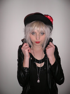
I really like this image because the seriousness of her expression create an intimadting and powerful mood. The pose of holding her collar also makes her look dominating and arrogant. These are clear features of a rock artists personality and what makes them so striking. Her eyes and lips are very alluring. I really like the hat because it fits in with the rest of her outfit, especially the red flower tieing in with her bold red lips. I initially decided that out of all locations I wanted the front cover main image to be one from the white wall pictures. This is because it will be easy to fit everything around it and it will stand out in contrast to the whiteness. I have decided to use this image for the front cover because of the pose and I can image all the other features of the front cover surrounding it.

Location #2

This image is low angle which makes the model look superior and powerful. Her serious expression relates to this but at the same time contradicts to being in a playground which represents fun and youth. I really like this image because it enables you to see her whole outfit which is quirky and modern. Also, the colours in her outfit go with the red poles and blue bars. The outfit stands out due to the darkness. This image would be suitable for either the contents or a small image on the front cover because it fits in with the colour scheme.

This contrasts to the image above as this is a high angle shot. This represents vulnerability and innocence which relates to being in a child swing and a playground. I really like the use of swings and props in all images because it is interesting and unique. Also there is great eye contact with the audience. The only problem is that her arms look a bit uncomfortable.

The models bright hair and outfit really stand out in contrast to the dark background which is why she is so dominating and all focus is on her. Again I really like the use of the bench and there is even blue bars of the bench which tie in with her blue sweater. The only problem with this image is there is a bit too much exposure on her face making it very bright but this can be adjusted. Again there is too much exposure on the models face but this is not a major problem and can easily be adjusted. This picture also needs to be cropped because by slightly trimming more of the ground off, it will put more focus on the model. The photo isn't busy and the bench is simple which is an advantage because there is already a big focus on the model. The model is slightly leaning towards the camera which is very inviting to the audience. Again she has a striking and dramatic pose. The whole point of this location was to illustrate the models fun and quirky side which completely contrasts with the edgey and eery location #3. All locations are expressing the different sides of the models personality.

Location #3 I love this image because the location looks amazing. The lighting makes the place look eery, dark and mysterious which relates to the darkness of rock music. The problem with this image is that because the location is so overwhelming, it takes emphasis of the model. The model doesn't stand out due to her dark clothing but this could be adjusted by changing the lighting around the model.

This image is much better then the above because there is more emphasis on the model but you can still see the brilliant background. Because the model is closer, there is more lighting on her making her the focus. This is another example of a low angle shot which makes her superior and therefore important. Her moody facial expression relates to the eery location which is important because it would look silly if she was happy and smiling in a dark and chilling place.

This picture is interesting because the colour of the trees and surrounding matches the colour of the model's dress. In addition, her black leather jackets and boots make her prominent and stand out. I think it is important to match colours because it creates a proffessional appearance and clashing colours can look messy. I like the background because it looks edgey and dark but I think the tunnel pictures are more interesting.

I like the model's expression because as I have said before I want to demonstrate a fun and youthful side of her. This relates well to the graffiti wall because graffiti illustrates youth and uniqueness. The only problem with this image is that is quite long which means the model only takes up half of the image in terms of height. As a result she is not as dominant as some of the previous pictures. However, this can easily be solved by cropping but this does mean you have to sacrifice some of the brilliant graffiti.

I love this image because the model looks so pretty and it all looks so effortless but still effective. Her pose is casual and simple but again so effective because she looks amazing. It is quite close up meaning she is covering parts of the background but you can still see enough of it. That doesn't matter as much anyway because the model is the main focus. Another reason why I like this photo is because the great eye contact really attracts you in and her facial expression is so serious making her look mysterious and interesting. I think this would make a great main image for the front cover but because of the background I think it will be to difficult. I am still definitely going to use it somewhere in my magazine, probably the contents or a smaller image on the front cover.

Rock music has a reputation of being rebellious and outspoken which is what I wanted to portray in this image. I particularly like this image because it looks natural and not staged. This is important because I want my magazine and its stories to be believable. It is a great action shot but I did miss out her left hand. This could be and advantage though because again it adds to the picture being natural and looks like it was taken without too much thinking. Basically it doesn't look staged and that I quickly captured her moment of madness.

Wednesday, 14 April 2010

Photoshoot requirements and inital ideas

Photoshoot requirements
Front cover – 3 photo ideas, secondary images
Double page – Main image (3 ideas), secondary images (minimum of 3)
Contents page – Main image (link to front page/ double page image) several (5 minimum) other images.
Things to be considered when taking photos:
* Location
* Props
* Lighting
* Costume
* Background
* Mise-en-scene
* Models


Initial ideas

For my main story and model I am going to take a large amount of photos in 3 different locations with 3 different outfits to give me a wide variation to choose from.
Location #1 - A plain white wall which will contrast to her black outfit, dark eye makeup and vibrant red lips. These will mainly involve close ups and mid-shots because I think this plain setting will be ideal for the main front cover image.
Location #2 - A playground. To reflect the child environment, the model will be wearing funner and brighter clothes compared to the location #1 outfit. This includes a bright blue sweater/cardigan, rough denim shorts and black boots. I will be taking pictures on various things in the park including a see-saw, slide and swings.
Location #3 - An arched bridge next to the forest. This is such a great location because the bridge looks so ancient and authentic at night. There is also grafitti inside which is brilliant because it involves different vibrant colours. The sense of darkness creates an eery and mysterious atmosphere which will tie in well with the rock/indie genre. I will also take pictures in the old and damaged trees beside the bridge. In this location the model will be wearing a gold long shirt/dress, leather jacket, black tights and black boot heels.

For a different story I am taking inspiration from the picture at the top of my blog of rihanna surrounded by CD's. The story is going to be based about "the princess of rock" so I want the model to look innocent and girly but with an edgey and rocky attitude. To create this I would like the model to wear a skimpy but not too revealing top accompanied with a pink bra which illustrates her girlyness. In additon to this she will be wearing a leather jacket which is associated with rock and it will also slightly cover her skimpy outfit. I want her makeup to involve light pastle colours including pink cheeks and lips but dark smokey sexy eyes. Her hair is going to be voluminsed and slighty wavy creating a sexy and girly impression. The photos are going to include her laying on CD's and also standing up ones infront of a pink wall. This will contrast and stand out next to her black outfit.

For another story I want it to be about band members being more then just friends. To illustrate this I want to have a male and female to be intimate. This includes them kissing, him kissing her neck, biting lips, tugging of shirts etc. It is highly important for them to look sexy and seductive, rather than cute and soppy. Therfore, I am going to take the pictures in colour but desaturate them to create a more dark and mysterious atmosphere. In keeping with this I will be taking the photos in the woods at night. I want them both to wear white tops to contrast with the black and white. I may also make the female wear a colourful flower in her hair so when desaturating the picture I can transform the flower into its original colour and this will then stand out as the rest of the picture is in black and white.

My pug is about winning Reading or Leeds festival tickets. Because of this I am going to take an image of someone that has been to Reading 4 times. I am not interested in the person themself but instead I am going to take a unqiue picture of his arm because it has 4 different Reading festival wrist bands.

Double page spread idea #3

Out of all the double page spread ideas, this one is the most packed and busy. For that reason I really like it because as I've mentioned before I want my magazine to follow a theme of choas and hecticness. This is to create a fun and modern impression. I like how the images symetrically run down both sides and it takes up quite a bit of space, hence the busy look. It is also quite unique how the title is ontop of the image. In all of the double page spread ideas I have included a quote. This is because when analysing existing magazines I discovered that it was a common convention. I think it makes the page seem more professional and realistic.

Double page spread #2

This idea was highly influenced by the NME legends edition which you can find in my analysis of existing music magazines. In particular it was the double page spreads that were about each member of greenday. It basically divided the page into a page with text and an image covering the rest of the other page. I also took the idea of doing a little fact box about the person featured which I think is a fun and interesting idea. The only difference to NME's was I placed another image on the text page so the page isn't plain and it shows the model in different locations.

Double page spread idea #1

This idea shows that the main image and title run throughs both pages. When constructing a double page spread I will have to be very careful in where the crease of the magazine is. It is still possible to have things overlapping onto both pages though. This idea includes a quite a few images which is quite uncommon for typical double page spreads. Ones I have analysed have shown a very large main image and then one or two small images. I still want my main image to be the most dominant and effective image though.

Contents idea #3

This idea is different to contents idea #1 and #2 in the way that contents is vertical. This is a unique style that enables you to include more stuff on the page because it doesn't take up a lot of space. Also this idea isn't as busy as the other two contents. However it still includes a lot of images and I want to use little unique elements such as putting ripped tape on an image or a few. This makes the image appear rough, edgey and young.

Contents #2

From this idea I wanted to achieve a sense of uniqueness which I think I have as I havn't seen a contents like this is any existing music magazine. The text is in the middle surrounded by a lot of images. This idea follows the theme of choas and hecticness which I want my magazine to portray to attract my young audience. It creates a vibrant and fun impression. Similar to contents idea #1 I have included a lot of images, different shapes and angles to make them appear more interesting. There is not a blank space on this contents which makes it so prominent and powerful.

Contents idea #1

This idea is very simple but if I carried through with this idea I would make it more exciting by using a bold and interesting font. Also I would use a lot of exciting and vibrant images to make the plain layout more busy and quirky. The sketch illustrates how some images are angled and have unique shapes which is far more interesting than straight positioning. Small images surround the larger main image which makes it clear what the main story is and how significant it is.

Front cover idea #3

Again this idea is quite simple, emphasising the importance of having a good quality and effective main image. This idea is very similar to Q's Cheryl Cole edition in the way it doesn't include any other images from other stories. This makes the reader focus on the main image. I have tried to make unique elements in the way that the mastplan is vertical and that all of the writing is on one side. Like front cover idea #2 I have used a pug again to follow conventions of existing music magazines. In all of the front cover ideas I have included a strapline because when analysing magazines I came across them a lot. It will make the front cover look more professional and realistic.

Front cover idea #2

This idea is quite simple compared to #1 and it follows the typical layout of a front cover. This includes the mastplan being at the top and then a close up image of the model below it. This idea is simple but if I produce an excellent photo it will still be effective. The close up image makes you focus on it and makes it clear it's the most important thing. I included 3 images which could be about other stories or the main story. However, next to the main image it may look a bit stupid and possibly pointless depending on the quality of the main image. Also I thought it was important to include a pug to make my magazine look professional and realistic.

Front cover idea #1

Through this idea I am trying to portray choas and a busy look. I want to put a lot of stuff on the front cover to create a a fun and quirky impression. Having a full length shot of the model enables a lot of other features to surround it and therefore doesn't take up too much space but still is a prominent image. I have put the masthead running through the image which again doesn't take up a lot of space. Also when analysing existing magazines I never came across this idea which makes the positioning very unique. Overall, the aim of this idea is to create a young, modern, quirky, fun and vibrant impression which will attract my young target audience.

Tuesday, 13 April 2010

Analysis of questionnaire

I produced a questionnaire because I wanted to find out what my target audience likes and expects from a music magazine. It also enabled me to have feedback on my ideas and therefore it played a big role in my final decisions. I wanted a fairly even amount of males and females respondants, which resulted in my questionnaire being answered by 10 males and 18 females. In doing this it gave a more accurate result because it reflects my target audience of teenagers which are male and female. In relation to this 50% of the people were 17 years old which again relates to my teenage audience. 10 people were aged 16 and 4 people were aged 18. Nobody was below 16 or over 18 which is a good thing because they go out of the range of my older teenage audience. The majority of the people's favourite genre was indie/rock which again makes the results accurate when it comes to feedback because my magazine is going to be focused on the indie/rock genre. Other popular genres were Pop, R'n'B and House. The next question focused on what type of magazine the respondants normally buy. Music and celebrity magazines both had 7 votes and fashion shortly followed with 6. Obviously I have no choice in making a music magazine but I wanted to find out what was important to my target audience. As celebrity was joint first I am going to make my magazine with the assumption that my main model is a famous artist. This is a way of attracting my audience as I know they're interested in them. Aswell as this fashion is proven to be important so it is essential that my models clothing is fashionable and stands out. The questionnaire showed that the majority of people, 21 votes purchase a music magazine now and again. 7 people said monthly but there were no votes for daily, weekly or annually. This shows that the magazine has to be pretty amazing and eyecatching for people to buy it. It is not a routine thing for these to buy so my magazine will have to stand out on a shelf so it can be an impulse buy. Also existing magazines such as Q only produce an issue monthly which could be a reason why people buy magazines monthly or now and again. The next question was very important because it was asking how much people are willing to pay for a music magazine. This is because I wanted to find out a good price for my magazine. If the price was too high it would put customers off but at the same time a too cheap price could make the magazine appear cheap and bad quality. Also if the magazine was real, the company and publisher would be recieving less revenue then there potential. The majority of people were willing to spend £3 but nobody was willing over £5. The next few questions specifically focused on my magazine's possible ideas and design. I found out that images was the most important thing when attracting people to a magazine with 14 votes. This means I am going to have to produce excellent, unique pictures to catch the reader's attention. Celebrities recieved 5 votes which I previously stated above the importance of them. The young culture of these days revolve a lot around celebrities and fame so I think it is important to produce my magazine on the assumption that is a well known, successful brand. Colours also recieved 5 votes which means my audience will recognise a colour scheme throughout my 3 pages. The sterotypical colours of rock are black and white which I will use but I want to add drama and vibrance with large use of red. I may also include other loud colours to create a busy and modern appearance. I don't want them to overpower the image though because as the questionnaire shows it is the thing that attracts an audience the most. I wanted to ask people their favourite name for a magazine because I could only narrow it down to 10 ideas. It was important to gather feedback on people's favourites because my opinion could be very different to others. The results showed that the favourite name for a magazine was ERA which is what I am going to use. I like it because it is short, blunt, quirky, unique, edgey, memorable, modern and it is proven that my target audience like it. Most of these questions are focused on the front cover because I suppose it is the most important of a magazine as it's the first thing the audience sees. It has to make a powerful impact. However, a contents page is still very important which is why I asked the question of what makes it effective and keeps the reader interested. Similar to the front cover, the results showed that the most important thing was images. This means I want my contents to include a lot of great, interesting photos. Another thing that was important is colours. I want to create a colourful contents page that follows the same theme of the front cover and double page spread. I think it's important to include bright, vivid colours because they catch the reader's attention and brings the page alive. In this analysis I have been quite vague with the precise figures and choice of answers because I thought it would be boring to read every single detail. To see any of the questions and results, it is shown in the questionnaire down the right hand side of my blog.

Initial Ideas

Images
I am going to use the girl pictured on the right as my main model for both the front cover and double page spread. I believe she has the perfect style for a rock/indie magazine as she is a follower of this genre. She is a typical example of my target audience. For the photoshoot I have a clear image of what I want Harlie to look like. I imagine her with big bright blonde hair, smokey darak eyes and bright red lips contrasting with her pale skin. I also want her to wear a leather jacket and dark clothes to show her rock and edgey side. I want to take a wide range of photos in 3 or 4 different locations each with a different outfit so I can choose from a large variation.
...............
Colour scheme
The colour scheme for my magazine is going to consist of red, black, white. This is going to maintain throughout the front cover, contents and double page spread so my magazine looks professional. Black is typically associated with the genre rock and is commonly used in music magazines. I think it gives an edgey and bold impression which is why I want to use it. White will look good with this as they are contrasting and all the colours will stand out on white. Black and white could be quite boring on its own which is why I want to use red aswell. Red is vibrant and dramatic which will stand out on block colours. Red portays passion which can be used in my magazine to illustrate the passion of music. The colour scheme red, black and white is similar to Q's edition featuring Cheryl Cole which is very classy and mature. However, I am targeting a younger, teenage audience. For this reason my magazine is going to include elements of black, silver and other vibrant colours which will create a modern and quirkier impression.
...............


Title ideas

When brainstorming I came up with many ideas for my magazine. These include:
* LCA - This is using the idea of NME. Out of all combinations of letters I chose to simply go with my initals. The title is to the point and short which means it will not take up a lot of space on the front cover. However a lot of people may not link the connection to my initials which means it is quite pointless and this is why I don't think it will be a good idea using it for the title of the magazine.
* Rebel - I thought of rebel as it relates to the attitude of rock and indie. A lot of rockstars are very rebellious and my young target audience look up to them as they are seen as cool. Again the name is short and blunt. I really like this name but I don't think it's very original.

* Sound - I like this name because it clearly relates to music but it is to vague. There is no clear connection with rock as sound can be related to any genre of music. Again I don't think it's very unique.
* Youth - I came up with this idea because I wanted to make it clear who I am aiming my magazine at. I think this is a clever idea that will unconiencely attract a young audience and deter an older audience. However, I don't think it is exciting enough for a title and it doesn't stand out.
* Era - I really like this name because it is short, catchy and blunt meaning it will not take up too much space on the front cover, enabling a lot more things to appear on the front cover. I can really imagine ERA as a magazine title as it sounds professional and modern. You don't really connect era to rock music but I think this is why it is so unique.
*
Influence - I really like this name because I have done a lot of research on influences of rock to make my magazine. When analysing magazines I was highly influenced by Q and Kerrang magazine. It relates to my young target audience as their style and attitude is high influenced by their favourite bands and artists. Influence is quite a long name though which means it will take up a lot of space. Also I think it sounds quite mature compared to my other funkier and edgier ideas.
* Role - This idea came from role models but I shortened it as that would be too long for a title. My young audience have a lot of rock role models which I want to portay in my magazine. However I think it sounds a bit boring and plain.
* Leader - Again, this is in keeping with the theme of role models, inspirations and influences. I think it is quite a powerful and unique name. On the other hand it is quite long and I can't imagine it as a music magazine title.
* Chaos - I really like this title because it illustrates youth, quirkiness, fun and rebellion. It is ideal for the impression I am trying to illustrate and to connect to the audience. it clearly relates to the rock/indie genre. However, I don't want my magazine to appear cheesy and unprofessional.
* Havoc - This is very similar to chaos in the mood and impression it illustrates. It is catchy, memorable, unique and exciting. Also I think it sounds less cheesy than chaos which is very important.


My favourite titles are ERA, Influence and Havoc but I am going to gather the results from the questionnaire to find out other peoples opinions and decide from there.
...............


Fonts

When looking for a font for the title of my magazine, I couldn't find any on photoshop that were ideal. From this I decided to look on the internet and came across the website dafont.com. There were thousands of possible fonts and this is where I found masterplan.

I chose this font for the title because I think it looks modern, edgey and bold. I particularly like the faded and patchy parts because it shows roughness and quirkiness. Without it, it would be quite simple and not have the same effect. It is still quite simple but it's effortless and professional.

Saturday, 27 February 2010

Target Audience


This is Charlie and she is an example of my target audience. She is 17 years old and lives in the inner city of London. She really enjoys the loudness and chaos of a busy city. She is currently doing an art & media course at college as she really enjoys both lessons and has a creative personality.
On an average day she dresses for comfort and simplicity, such as wearing skinny jeans or leggings with a baggy top. However she brings a sense of uniqueness to her style and still looks fashionable. You could say she can be quite tom-boyish but when it comes to going out at night with her friends, she likes to dress up like most girls. She loves a good pair of high heels and statement jewellery. Her favourite shops are Topshop, All Saints and she also finds a few good buys online on Asos. She is not embarassed about shopping in charity shops either as it means knowone else will have the exact same clothes as her. Originiality is very important to her and she occasionally finds a lot of inexpensive, vintage style buys.
Charlie has a big passion for indie/rock music. She religiously attends the Reading Festival every year with a large group of friends. She also goes to a lot of gigs in the rest of the year which mostly consist of not well known artists that are making their way up in the industry. Her other favourite artists include Kasabian, Muse, Florence & the Machine, Kings of Leon, Paramore, Artic Monkeys, classic legends Greenday and many more. However, Charlie is open to other genres of music such as RnB, Dance and Pop as she loves something to dance to. She has a secret love for Lil Wayne's music since he has had a more edgey, rocky style.
Charlie is an outgoing person so it is more common for her to be out than at home. However, when she is home she likes to watch programmes such as Skins, Friends, Scrubs, Never Mind the Buzzcocks and other humourous programmes. Charlie would much rather watch a clever, well written and made thriller that makes you think rather than a soppy 'chick flick'.
Charlie is a perfect example of my target audience as she is a fashionable, quirky teenager that is passionate about music. I want to create a young, modern, unique magazine that will attract a person that has those features to their personality and style. I want my magazine to emphasise youth and rebellion which reflects the genre rock.

Saturday, 20 February 2010

Aspect of theory to do with audience


Maslow's hierarchy of need

Maslow created a Hierarchy of needs (shown left) He believed it showed what people wanted from their job. He thought everyone starts as the bottom and works their way up to the top. The basic human needs such as food and shelter are represented at the bottom of the pyramid and the higher you go, the more luxury items. This is where my music magazine comes into relation with the hierarchy. My music magazine would be at the top of the pyramid as it is not a necessity to survive and would be seen as quite a luxury item for some consumers.


The triangle splits into:

- Self actualisation - fulfilment - learning new skills, challenges etc.

- Esteem needs - recognition of achievement.

- Social needs - frienship, contact - communication.

- Safety needs - job security and safety.

- Physical needs - ability to pay for food and shelter.

The main problem with Maslow's theory is that different people have different needs and not everyone will fit the same pattern.

....................

Uses and gratification theory

The theory is a reaction to traditional mass communication research emphasizing the sender and the message, stressing the active audience and user instead. Psychological orientation taking needs, motives and gratifications of media users as the main point of departure.


Uses and gratificatiom theory attempts to explain the uses and functioms of the media for individuals, groups and society in general. There are three objectives in developing uses and gratification theory:


1) to explain how individuals use mass communication to gratify their needs. 'What do people do with the media'.


2) to discover underlying motives for individuals' media use.


3) to identify the postive and the negative consequences of individual media use. At the core of uses and gratification theory like the assumption that audience members actively seek out the mass media to satisfy individual needs.

....................

Audience Demographics

Demographics refer to the charactersitics of the human population and population segements, especially when used to identify consumer markets. Demographics regard socio-economic factors such as age, income, sex, occupation, education, etc. Audience demographics are a very important aspect of media planning in matching the media with the market as industries/companies often define their target market in terms of demographics. For companies, identifying the demographic groups that will be most interested in their product, can mean the difference between success and failure.

....................

Audience Profiling

Audience profiling is a detailed description of consumers charactersitics (demographics) and there attitude and behaviour (pschographics) toward products. This allows a company to make the best decisions regarding their customers and the best marketing strategies to sell their product or service. Audience profiling allows a company to communicate and get involved with their target audience in an effective and sucessful way.

Analysis of Kerrang's double page spread


Colour: The main colours used are black and white which clearly stand out on eachother as they are a complete contrast. Black is sterotypically associated with indie/rock which is why it has been used on these pages. There are also elements of red and yellow which add vibrancy and therefore make the page look more interesting. As the rest of the page is quite plain, the use of red and yellow vividly stand out. Overall, the black and white make the double page spread edgey and serious but the elements of red and yellow make it young and quirky.

Design: It is very common for the main image to be surrounded by the text. However, on this double page spread the image takes up the whole of one page and then the text is on the other. The thing that clearly connects the two pages is the use of the border. The border does not split down the middle of the page which shows the two pages are connected. The border is in a ripped, jagged style which shows roughness and unneatness. This makes the page more quirky and modern. This reflects the genre and the young target audience. 'Meet the band' is in a unique, edgey style which relates well to the rock genre. The title is in slanted, bold capitals where each letter is tilted in different positions illustrating originality and fun. It rebels against the usual straight text which reflects Greenday's rebellious and unique image. The rest of the text is in a more formal font style making it easy to read and looking completely different to the rest of the text. Each piece of text has a different font style but they all fit in well creating a busy but somewhow still neat appearance.

Image: The only image is a large one of Billie Joe Armstrong, the lead member of Greenday. The majority of Kerrang readers will recognise him as he is a 'legend' but to make it clear next to him is his name in a very large font. The image is a long shot making it able to see his whole body and it dominates the page. The image is surrounded with a border with tape on it which again illustrates roughness as tape is usually used to mend things or put things back together.

Pose, hair, style, make-up: Billie Joe has a very powerful pose that dominates the whole of the page, reflecting his powerful position in the band, the main member. He has a plaim expression which relates to the laid back, cool attitude of rock. It would be unusual for a rock band to smile as it would ruin their image of being cool. His expression makes him come across quite sexy and mysterious aswell. The majority of his clothes follow a theme of black which is associated with rock and they make him stand out on the contrasting white background. You can slightly see his red socks shows his fun side and is a complete contrast to his plain facial expression. Greenday are well known for their laid back attitude, not taking life too seriously and living life to the full so showing his red socks shows he actually has a fun personality outside of his passion for music. Billie Joe makes a boring suit quite trendy by having an out of place tie, studded belt, skinny short jeans and casual shoes. The target audience will think he's cool and aspire to be like him. Greenday are well known for being role models as they are seen as 'legends'. Billie Joe's rough, dishevelled hair again creates a trendy and laid back attitude. You can slightly see his tatoos on his wrist which again the target audience would see as trendy. This contrasts to his smart jacket, tie and shirt combination. This again illustrates their uniqueness and rebellious attitude towards conventional things.

How are words used? The title of Billie Joe Armstrong takes up half of one page making it clear who the story is about and it doesn't leave a lot of space for the rest of the text. There isn't a lot of text but this page is only supposed to be a little summary of meeting the band because most readers are probably already very familiar with Greenday. By using 'Billie Joe Facts' it outlines important facts in a small space which gets to the point. The use of 'The boss...' relates to Billie Joe's position and again gets to the point with only a few words. Without even reading the text you know that he is the main member of the band. The text is then separated by a scribbly line which realtes the the scribbly handrwriting style used on the front cover and contents page. The rest of text is alligned in neat columns creating a neat appearance which is easy to read. Parts of the texts are highlighted in yellow to show they are interesting and important parts. A large letter to start off the text is very common but this 'A' is quite unique as it's on a red patch that vibrantly stands out as it the biggest element of red used.

Language: By reading the article you can see that a very laid back, informal language style is used which makes the article easy to understand and the readers can realate to it as they are not intimidated. You also get a very clear sense of humour from the band, especially on one of the highlighted sections. For example it is talking about Billie Joe's fondness of hair dye and if it extends to the contents of his underwear, by asking him if 'the carpet matched the curtains' to which he answered 'Actually I'm running hardwood floors.' This shows that the band have a fun personality which is seperated from their serious passion towards their music which is also made clear in this article. For example his music represents to him as 'ultimate freedom and a sense of individuality.' The title 'meet the band' is very simple and straight to the point, eliminating any confusion. This straight forwardness language runs through all the text used on the double page spread. A short quote, 'punk has always been about doing things our own way' has been used to outline Billie Joe's attitude and passion towards music. It is a powerful and blunt statement that subtlely persuades readers to read the whole article.

Overall impression: This double page spread gives you a brief but informative summary about the lead member of Greenday, Billie Joe Armstrong. The title does what it says, 'meet the band'. Overall, these pages create a modern, edgey, simple impression that will attract the young target audience, definitely Greenday fans. The pages include a lot of unique features such as the font styles used, highlighted sections, use of fake tape and a brief fact file. Even though the double page spread is youthful and quirky, it still looks professional and classy with the use of colours and neat structure of text.

Analysis of NME's double page spread

Colour: Interestingly, these pages do not have the same colour theme as the front colour of black, white and red. Instead there is use of light pastel colours such as green and blue. These colours portray a feeling of youth, fun and laid back. This relates to the hip-hop artist featured, Kid Cudi. The decision to not use the same colour scheme as the front cover could be because Kid Cudi is associated with hip-hop, unlike NME which mainly focuses on rock. Also, Kid Cudi isn't the main cover feature so the different colour scheme establishes this. There are elements of black which make those particular parts stand out as they are a complete contrast to the other light colours. The background has a stained, marble effect which portrays a modern and unique style. Most double page spreads just have a plain white background or other block colours. Overall, the colour scheme creates a young and fun mood which is clearly different from other stories as it is not associated with the genre rock.

Design: The image dominates the pages by spreading across both pages. The text surrounds the image in neat columns which is commanly seen in double page spreads. This makes the text look neat and professional. The title is in a large bubble writing style which is funky and young. Interestingly, the rest of the text is in a more formal style. However, it is still more modern than the classic times new roman style.

Image: There is only one image which is obviously of Kid Cudi as this article is about him. It is important to have a large image of him as usual NME readers may not be familiar with him as he is not associated with rock. This is also why it is a close-up. The image is taken where there is a chaotic, vibrant background with use of many different colours. The colours relate to the rest of the page, as there are mainly green and blue elements. The background seems to be slightly out of focus which means that even though the background is quite busy, you still focus of the most important thing, Kid Cudi. The grafitti background is stereotypically associated with hip-hop which Kid Cudi is involved in.

Pose, style, hair, make-up: Kid Cudi is wearing a light green hoodie which again relates the the colour scheme and also hoodies illustrate his 'bad boy' image. A bad boy image is commonly associated with the genre hip-hop or rap. His watch comes across as being quite expensive as it looks like gold which shows his success and fashion. He is also wearing geeky glasses which are very fashionable nowadays and despite his hoodie and swearing, it makes him more friendly and approachable. His outfit portrays him as being young, funky and very fashionable. Kid Cudi is shown sticking his tongue out which makes him look cheeky and rebellious. It shows that he has a laid back attitude and doesn't take life seriously. This also relates to him swearing with his finger which is again rebellious and quite disrespectful. Again it is portraying a 'bad boy' image. Swearing shows that he doesn't care what people think and he thinks he is better than other people. He isn't shown as being a good role model. This relates to his selfish and arrogant mentor, Kanye West. Again, his cheeky attitude along with his geeky glasses still make him lieable and not intimidating.

How are words used? The title 'The arrest is history' is a clever pun as it is a play on words of the famous phrase the rest is history. The word arrest is used again as it relates to situations Kid Cudi has been in and it clearly outlines parts of his personality. Again this fits into the 'bad boy' image. Arrest and history are in bright different colours as they are the most important words in the title so they clearly stand out. There is then a few short sentences that are larger then the text underneath it. The few lines give a summary of what the story is about and they leave it quite open without explanations to make you want to read the rest of it. An example is 'she almost got shot' which is very shocking, blunt and interesting so you want to know how this situation happened. People that know of Kid Cudi wouldn't expect anything less than a drama. 'Here's what happened...' provides a flow between the summary and the rest of the text. Kid Cudi is in bold which makes it clear who the story is about as it actually doesn't say it in the title and the target audience of NME, young rock fans may not recognise him from the image. It is common in double page spreads for a large letter to be used to start off the text. The K is in the same style as the title and it also relates to the artists first name Kid.

Language: A quote is used which is very common for double page spreads. It gives you a little insight of the article and the persons personality. It is a technique that grabs your attention and subtlely persuades you to rread the rest of the article. It clearly stands out due to being in bold and capitals. The quote includes a question, 'do I feel like king of the world?' This is not classed as a rhetorical question as there is actually an answer. The answer uses humour and shows immaturity which relates to Kid Cudi's laid back and and rebellious attitude. In various parts, the text is in capitals such as 'TURN SLOWLY TOWARDS ME!' showing shouting and a serious moment. These parts clearly stand out which make them appear interesting. The whole article is explaining about a journalist's journey when going to interviewing Kid Cudi so the language is normal everyday speech and has quite an informal tone. This makes the article easy to read and not intimidating. The whole story of Emily Mackay's journey is very exciting and interesting which reflects the language used to make the readers get a clear image of what it was like and feel involved within the story.

Overall impression: This double page spread attracts quite a wide audience because obviously hip-hop fans and Kid Cudi fans, will be very interesting in reading it. But also usual NME readers might be quite interested in reading this as they are probably not too aware of Kid Cudi. This article gives a good insight of his personality and music. Overall, the double page spread creates a young, modern, quirky, rebellious mood. Rebellion is one major thing that both genres, hip-hop and rock have in common. This feature is clearly seperated from the rest of hte magazine, mainly due to the different colour scheme that is not associated with rock.

Wednesday, 17 February 2010

Analysis of Q's double page spread

Colour: In keeping with the front cover and contents, the colour scheme of red, black and white is used again. This maintains a flow through the magazine which makes Q seem professional and of high quality. Again the use of black and white would not be as powerful on their own but the slight elements of red make such a difference. Red adds virbrancy, passion and drama to the page. The background is white which makes the black and red elements stand out. It would be unusal for a rock magazine not to include the colour black as it is stereotypically associated with the rock genre. Like the front cover and contents, the colour scheme creates a classy, dramatic and bold impression about the double page spread.

Design: One of the images dominates a whole page expressing importance and power. The other image is on the other page in the bottom right hand corner surrounded by the text. The text and images are clearly seperated making the page smart and neat. The text is in ordered columns that reflect a newspaper style. This makes the article appear formal and mature which relates to the older target audience and the magazine itself. Also the times new roman text style stays within the theme of maturity. The line at the top seperating the article from the title and the thicker line at the bottom seperating the article from the page number, again create a smart appearance which expresses high quality.

Images: The main article is about Cheryl Cole so it is obvious that the main image is of her. The front cover shows a more personal image of her face but on this page it is a long picture. This enables the readers to see her clothes and body which the men in particular will be interested in. It also allows the image to take up a lot of blank space. The white background makes the reader entirely focus on Cheryl Cole as nothing else is happening in the background. The image is harsh and powerful. The other image relates to the one used on the front cover due to rain. All of the images of Cheryl Cole in the entire magazine follow the similar pattern of dark colours and seriousness.

Pose, style, hair, make-up: Cheryl Cole has a very seductive pose in the main image where she has her hand above her head and she isn't looking directly at the camera. She looks sexy which will attract men and women will aspire to her. She has a very serious expression which relates to the target audiences serious attitude towards music. Not one of the images has shown Cheryl Cole smiling but that would not make sense as the article is talking about the serious issue of her not knowing who she is anymore. She is used to putting on a fake smile for the cameras covering up her feelings but that is masking her true emotions. The main image shows her wearing the same outfit as in the contents. This consists of studs, slits, wet looking clothes and the main colour black which all are sterotypically associated with the genre rock. She is wearing revealing and provocative clothes that make her look sexy. This will particularly attract the male target audience. In the smaller image she is wearing a top hat which creates a shadow over the top half of her face. This cleverly links to the quote beside it 'I don't know what I look like any more'. This creates a mysterious mood. Both images show a wind swept hair effect which accenuates her brilliant features, particulary her defined cheekbones and jaw. So many women would dream about looking like this and so many men would want a girlfriend looking like her. Cheryl Cole's make-up consists of sexy smokey eyes, perfect pale skin and alluring seductive red lips. The colour of her lips really stand out and relates to the red elements on the page and the famous logo of Q.

How are words used on the cover? There is a large C in red which dominates the first page. The red and size really grabs the readers attention but it is still able to read the text underneath as it is in black. Obviously C stands for Cheryl which the readers will easily be able to recognise. Cleverly, there is another C beside it but in much smaller which refers to her surname, Cole. The large size and vibrant red signifies that her first name is far more important than her surname as it is actually her married name. She doesn't want to be known for being Ashley Cole's wife, she wants to be seen as an individual and have her own sucessful career which she cleary has. Interestingly, nowadays she is far more famous than her husband. The title 'Cheryl Cole' shows two different things as Cheryl is in itallic and Cole is in capitals. The itallic style shows a more girly and feminine side which Cheryl Cole is more known for and the harsh style in capitals portrays a much more strong and serious side. The title expresses the many different aspects of her personality. A quote is used which is very common in double page spreads. It is sectioned off from the rest of the article and clearly stands out due to being in red capitals and a larger font compared to the rest of the text. A quote gives the readers a little snippet of what the article is about and they are normally left quite open so the reader will have to read the article to understand it.

Language: The quote includes a rhetorical question, 'do you know what i mean?' which makes the readers think and therefore makes them feel more involved. It creates a more personal relationship between the reader and magazine. There is a short line on the smaller image saying, 'Best looking 'Slash' kissogram ever steps out.' This adds humour which completely contrasts to the serious story and Cheryl Cole's serious expressions. Humour eases the mood and adds a bit of fun. The language of the article is a bit higher than everday language but not to the extent that younger people will not understand it. The language is not intimidating but will especially target an older, maturer audience. There is a lot of text which shows the images and text are equally as important. A younger audience would be far more interested in the images than text.

Overall impression: The double page spread is kept quite simple and plain but it is still effective. The small elements of red and the powerful images make such a difference. The older target audience would not care about the simplicity as they're far more concerned with what the actual article is about. The double page spread is classy and mature, much to the taste of the target audience. A younger audience would possibly not like it as much because there is nothing quirky or fun about it, it is too formal for their taste. The overall impression you recieve from this double page spread is a serious but classy mood which reflects the target audiences serious attiutude and passion towards rock music.

Tuesday, 9 February 2010

Anaylsis of Kerrang's contents page

Colour: There is no clear colour scheme because the majority of the page is taken up by numerous images all involving different colours. However the text is in black and red which relates to the colour scheme used on the front cover. There are a lot of black elements on both pages which is stereotypically associated with indie/rock so it is a conventional colour to use in a rock magazine. The background is white which makes the contrasting black and other colours stand out. There is a collaboration of different colours which add vibrancy and excitement.

Design: The contents spreads over two pages which shows the magazine involves a lot of information and the pages look neater as it isn't cramped all into one place. The images and text are on a plain background which make the colours stand out, especially the main colour black. The images are in a neat order, none of them overlapping and then followed with neat columns of text underneath. However, the use of a scribbly handwriting style, similar to the style on the front cover, makes the page seem more youthful and fun. This relates to the young target audience. The neat order of pictures would be too old fashioned and boring but by using interesting fonts, the contents is quirky and young. Each heading has a different and very unique font style which clearly separates each of them from the rest. Again they are modern and edgey which will attract the target audience. The uniqueness makes them stand out.

Images: The majority of the images are of the main cover feature, Greenday. However there is one image that is not, instead it it is John Lydon from the Sex Pistols. Sex Pistols would be classed as 'legends' along with Greenday so they fit into Kerrang's Legends Special Edition. Sex Pistols relate to Greenday as they were highly influencial to Greenday. There are a lot of images used in the contents showing stages through their career which shows how long they have been around. The biggest image showing them very young in the boot of a car, illustrates youth, rebellion and fun which will attract the audience. The target audience are influenced by Greenday which is why they look up to them with respect. There are only individual images of Billie Joe but that is to be expected as he is the lead member and the target audience will also know and expect this. There are 4 album cover images in a neat column which express Greenday's success and achievement. In summary, the images are illustratiting that Greenday is worthy of the title 'Legends'.

How are words used? It is clear from the domination of images that they are more important than the text. The text is structured in neat columns which makes it easy to find pages. Putting the page number in red followed by the page title in black also makes it easy to find pages and seperates each page from the others. The red stands out which attracts the target audience. The most noticable piece of text is the big title, Greenday. It clearly stands out due to size and the unique, youthful bubble writing style. The title refers to the images making it clear what this edition is focused on. The word contents is the only text on a red background establishing what this page is. It is quite small but the red background makes it stand out enough. The headings follow in a pattern, either being black text on a white background or white text on a black background. This makes the headings bold and brings attention towards the different sections of the magazine. The use of scribbly handwriting with arrows show specifically the images that relate to the pages, giving readers more of an insight of what is inside. There is a special dedication to the people that construct the magazine which is clearly seperated from the rest of the page as it's on a black background. The special dedication makes the magazine appear professional and respectful.

Language: Each page has been put into small categories which is a neat and smart way to show readers what the magazine will include. The headings are short and blunt, not being longer than 3 words which makes it catchy, simple and memorable. The page titles are also short and simple followed by a a short sentence giving more of an insight about the page. Without the summarising line, the pages would make no sense to the target audience, for example pages include 'California Screaming' 'Having a blast' and 'Burnout'. However, the use of musterious words make you want to read more about the situation. The text is in everyday normal language which diffuses any confusion and is not intimidating to the target audience. There are uses of subtle persuasion such as using the word 'Classic' instead of just stating interviews. This makes the interviews sound of high importance and special. Also one of the headings are 'Plus' which again sounds special and is very inviting to readers as they are getting a lot for their money.
Overall Impression: The contents looks very smart and professional due to the neat order of images and text. It expresses high quality and it seems that a lot of time and effort has gone into producing work of this standard. This is very important as this is a legends special edition so it has to live up to the name. The structure is mature and smart but the use of fun images and quirky font styles bring back the youth and uniqueness to the magazine. This relates to their young target audience. It is neat but shows a lot of things going on which adds excitement and vibrancy. It is clear that the page is targeted towards a young audience but Greenday's long career and the image of John Lydon enables an older audience to relate to it. The magazine attracts a wide audience as it is focused on 'Legends' of rock. Overall, the contents page creates a youthful, loud, quirky impression which relates to familiar elements of rock.

Saturday, 6 February 2010

Analysis of NME's contents page


Colour: There is no clear colour scheme because the majority of the page is taken up by the image of Blur. However the text is in black and red which relates to the colour scheme used on the front cover. Black and white are stereotypically associated with indie/rock but they can be quite boring used on their own. With use of red it adds vibrancy and it stands out on the other block colours. The cololur scheme creates a modern and classy look.

Design: Firstly, it is apparent that only one page is needed for the contents, unlike other magazines that sometimes use two. The contents is clearly seperated from the image by a dotted line to make the page look more neat and professional. It is almost like the list of pages is the only contents part and then the rest of the page is like starting a new page as there is a random story placed there. The list of pages is in a neat column beside the image but there is also some text ontop of the image. It is on a white background because it would be unclear to read otherwise. This makes the text stand out aswell. The majority of text has a similar font of a modern and informal bold style. It is young and quirky much like the target audience and magazine itself. The only exception is 'Blur, London 14/01/10' which is seen to be in a more formal style, similar to times new roman. Another reason why it is different from the rest of the text is because it is on a red background. They have done this to make it look different from the rest of the text and therefore stand out.

Images: There is only one image on this page and it dominates the majority of the page. Interestingly, it is not of My Chemical Romance, who was shown to be the main feature from the front cover of the cover of the magazine. This is unconvential for a music magazine which again relates to the uniqueness and rebellious style portrayed from the genre rock. The target audience, young followers of rock tend to want to express their originality and not follow rules. Instead, there is an image of an old rock band Blur, not on a photoshoot but them pictured on red carpet. Blur still fit into the category of rock so the target audience can still relate to them and since this is their first public appareance together in a while, readers will find this interesting. The members of Blur are wearing very laid back and informal outfits for the red carpet which expresses their coolness and attitude of not caring what they look like or what people think of them. This will be seen as aspirational to the target audience.

How are words used on the cover? Instead of listing the contents in page order, they are listed alphabetically with their corresponding page number. Again this is unconvential and unique. Also the contents is only a list of bands/singers included inside and there is no stories mentioned. This mysterious list doesn't give a good indication of what is going to be inside but the target audience will only care about what acts are featured and will be impressed with the amount in the list. The long list shows that the magazine is going to be filled with lots of things so readers are getting a lot for their money. The contents list is the only text in red which makes it stand out and makes it clear that it is important. The page numbers are in a black font to clearly seperate the band and page so readers will find it easy to understand. 'What's inside' and 'Snapshot' along with the bottom strapline, are the only text in capitals which makes it clear they are either titles or very important. They are purely in capitals to stand out. There is not that much text used on this page but as I've mentioned numerous times, the target audience is more concerned about the music.

Language: The traditional word contents is not actually used on this page. Instead there is 'What's inside' which is a much more younger and unique way of saying contents. This again reflects the modern nature of the magazine and readers. It also relates to the style of writing it is in as that is also young and funky. 'Snapshot' is again another funky word that is more traditional than other words like photograph or image. This page gives an impression that the magazine is using young vocabulary to relate to the young audience and come across cool and modern. The bottom piece of text is subtlely persuading readers to subscribe to their upcoming issues by making them think they are saving money in the long run. They do this by using the words 'sale' 'save' and 'now'. This is persuasive language that immediately makes you think of saving money. This is very important to the young target audience as young people are known for not having a lot of money so saving is vital, every little helps. They even give you their website and a hotline to make it easy to subscribe. Also they give you a small image of the next edition which gives you a taster of what is to come. The text explaining the image is very similar to a story in a tabloid newspaper. The writing is simple, everyday language that is easy to understand and even includes some funny elements. This is very important to the target audience because they will not want to read something that is untimidating and hard to understand.

Overall impression: The contents page is very basic and gives off an impression of a laid back attitude, similar to the stereotypical view of teenagers into rock, the target audience. It doesn't really give the magazine justice as not a lot of what is inside is explained on this page. However, it does show the very long list of acts featured inside, which is most important for the target audience to know about. This means they are not concerned with anything else, therefore it is a bit pointless putting additional things on the contents other than bands and singers. This shows that NME clearly know who their target audience is and what is most important to them. This idea emphasises the passion and love that the target audience feels for rock. The main impression you get from this page is the sense of youth and a current style. This is mainly due to the style and language of words that a older audience might not get or can relate to.

Anaylsis of Q's contents page


Colour: The colour scheme of the contents is inkeeping with the scheme for the front page, red, black and white. The most dominationg colour is red which adds vibrancy and passion to the page. The masthead, Q has always been red so the use of it in the contents relates to their famous logo. When regular readers look at the contents it will unconciously trigger in their head that the colour red is associated with Q. The colour scheme creates a vibrant mood but is still classy and sophisticated.

Design: The contents spreads over two pages which gives the impression that a lot is going to be included in the magazine. It shows the readers will get a lot for their money, their purchase is worthwhile. Everything is on a clean white background which makes all of the other elements stand out vividly. The writing is in a structural order surrounding the images whilst the images seem to be packed together overlapping eachother. A lot of information is placed in a small place but it still looks professional. It is far more interesting than having a neat row of precisely placed images. The overlapping style adds youth and fun. The words keep in theme with the colour scheme of red, black and white but the numerous images include all different colours. The clash of colours actually work and it makes it the contents page stand out more. All of the text is in quite a formal style, similar to times new roman. This illustrates that the target audience is more mature compared to young, modern magazines such as NME and Kerrang.
Images: There are a lot of images used in the contents to show you the different stories. Instead of writing the stories, the images have been labelled with a page number. This means they didn't have to list every page which would be very long and dull as Q is a big magazine. This makes the contents far more interesting and unique. Obviously the largest image is of Cheryl Cole as she is the main feature of this edition. She dominates the majority of the first page with a sexy pose that will attract the target audience. She is seen to be wearing dark reavealing clothes with slits, studs and spikes which create a dangerous, dark, edgy mood. This emphasises the genre indie/rock. Interestingly, it is the only image that is in black and white which stands out and clearly shows it is the main feature. There is also an image of the front cover which again reminds us of the focus on Cherly Cole. The images are completely different to one and another, mainly due to the difference in age. There are several images of bands with the use of guitars emphasising the genre rock. But there are also images of older people including Dean Martin. This shows the range of the audience and that the main target audience is likely to be of an older age because a lot of young people will not recognise Dean Martin or Holly Johnson. The images express the different generations of rock.

How are words used? The word contents really stands out as it is large and is the only text on a red background. Issue 283 is also very large which shows how the long the magazine has been around for, percieving a impressive and professional view. There is a lot of text used in the contents which again relates back to the main target audience, and older audience. A younger audience would not be interested in words and more about the images and music itself. The amount of writing shows the large content of the magazine. The text is in a quite structured order. On the first page, the text is all the features and on the second page it shows the regulars and the Q review. This structure makes it easy to know what is inside and what category it fits into. The large page numbers on the images again make it very clear where everything is. Every heading is boldly underlined in red which seperates the story and makes the page look quite classy and sophisticated. Again it is inkeeping with the colour scheme. The headings itself are in bold and capitals which make it clear they are the stories. They are then followed with a brief description of what the story includes.

Language: The headings are short and straight to the point making it clear what the article is about. By emphasing the regular features of the magazine by actually stating 'regulars', it creates a more initimate feeling between the reader and magazine. It relates to the audience aswell as some of them are seen to be regulars. There is use of exciting words such as 'special!' which is actually isolated from the rest of the text as it is in a red font, making it look important and interesting. The language is a bit more high class than everyday words but it's not to the exteme that it makes the magazine intimidating. It is just outlining that they are targeting a more mature, older audience and that it may not be to the taste of younger rock fans that usually read magazines like NME or Kerrang.

Overall impression: The contents pages show a lot of things happening in a small space but still manage to create a sophisticated look due to the neat structure of the text and the use of colours. The contents pages give a very good indication that a lot is going to be included in the magazine and that readers will definitely get more than what they paid for. The images show different generations which enables the magazine to be attracted by a wide audience. However, it is specifically targeted at a more mature audience and the classy, sophisated appearance of these pages reflect the personality of the readers. Also the contents pages emphasises the passion of rock which again relates to the target audiences music view.